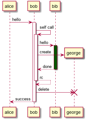
CODE:
<puml width="300">
@startuml
alice -> bob ++ : hello
bob -> bob ++ : self call
bob -> bib ++ #005500 : hello
bob -> george ** : create
return done
return rc
bob -> george !! : delete
return success
@enduml
</puml>
OUTPUT:
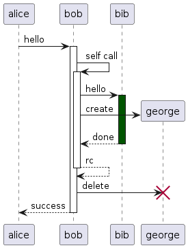
Image & Diagram Components
User Guide → Image & Diagram ComponentsThe image components here provide convenient syntax & styling abstractions on top of raw HTML and Markdown images. Diagrams, in the form of inline PlantUML components are also supported.
A pic component allows you to add captions below the image.
CODE:
<pic src="https://markbind.org/images/logo-lightbackground.png" width="300" alt="Logo" lazy>
MarkBind Logo
</pic>
OUTPUT:
 MarkBind Logo
Options
| Name | Type | Default | Description |
|---|---|---|---|
| alt | string | This must be specified. The alternative text of the image. | |
| height | string | The height of the image in pixels. | |
| src | string | This must be specified. The URL of the image. The URL can be specified as absolute or relative references. More info in: Intra-Site Links | |
| width | string | The width of the image in pixels. If both width and height are specified, width takes priority over height. It is to maintain the image's aspect ratio. | |
| lazy | boolean | false | The <pic> component lazy loads if this attribute is specified.Either the height or width should be specified to avoid layout shifts while lazy loading images. |
If you want to display images that are automatically linked to its image URL, such that one can click on the image to view the full image, take a look at MarkBind images.
<pic src="https://markbind.org/images/logo-lightbackground.png" width="300" alt="Logo" lazy>
MarkBind Logo
</pic>
An annotate component allows you to easily annotate over any images.
Annotate wrappers (<annotate>) are used in conjunction with Annotate
Points (<a-point>).
<annotate>: Annotate wrappers are used to hold the image and set its width and height.<a-point>: Annotate points define the position, text and style of each point within the image. Insert them between the Annotate wrappers.The x and y coordinates of each Annotate Point are relative to the image and are written in percentage of total width or height.
CODE:
<annotate src="../../images/annotateSampleImage.png" width="500" alt="Sample Image" lazy>
<!-- Minimal Point -->
<a-point x="25%" y="25%" content="This point is 25% from the left and 25% from the top" />
<!-- Customize Point Size (default size is 40px) -->
<a-point x="50%" y="25%" content="This point is 50% from the left and 25% from the top" size="60"/>
<!-- Customize Point Header (default is empty) -->
<a-point x="75%" y="25%" content="This point is 75% from the left and 25% from the top" header="This has a header"/>
<!-- Customize Point Color (default color is green) -->
<a-point x="25%" y="50%" content="This point is 25% from the left and 50% from the top" color="red"/>
<!-- Customize Point Opacity (default opacity is 0.3) -->
<a-point x="50%" y="50%" content="This point is 50% from the left and 50% from the top" opacity="0.7"/>
<!-- Customize Point Label (default is empty) -->
<a-point x="25%" y="75%" content="This point is 25% from the left and 75% from the top" label="1"/>
<!-- Customize Text Color (default color is black) -->
<a-point x="50%" y="75%" content="This point is 50% from the left and 75% from the top" textColor="white" color="black" label="2" opacity="1"/>
<!-- Customize Font Size (default font size is 14) -->
<a-point x="75%" y="75%" content="This point is 75% from the left and 75% from the top" fontSize="30" label="3"/>
<!-- Customize Label (default is a rounded button) -->
<a-point x="75%" y="50%" content="This point is 75% from the left and 50% from the top">
<span class="badge bg-primary">Badge label</span>
</a-point>
</annotate>
OUTPUT:
Use markdown in the header, label and content
Annotate Points supports markdown in the header, label and content.
CODE:
<annotate src="../../images/annotateSampleImage.png" width="500" alt="Sample Image">
<a-point x="25%" y="25%" content="# Content" />
<a-point x="50%" y="25%" header=":blush:" />
<a-point x="75%" y="25%" label=":heart:"/>
</annotate>
OUTPUT:
Customising shapes for Annotate Point
Annotate Points supports different shapes and customisation.
The default shape used is a rounded button.
Style the shape to achieve the same effect.
CODE:
<annotate src="../../images/annotateSampleImage.png" width="500" alt="Sample Image">
<a-point x="40%" y="-2%" content="Look within this box">
<div style="width: 330px; height: 150px; border: 2px solid red; margin: 20px auto;"></div>
</a-point>
<a-point x="50%" y="75%" content="You should pay attention to this!">
<div style="opacity: 90%; color: red; font-size: 40px">!!</div>
</a-point>
</annotate>
OUTPUT:
Using triggers and positions for Annotate Point
Similar to popovers, Annotate Points also support different types of triggers and positions for users with different needs.
CODE:
<annotate src="../../images/annotateSampleImage.png" width="500" alt="Sample Image">
<!-- Default Trigger (click)-->
<a-point x="33%" y="33%" content="Lorem ipsum dolor sit amet" />
<!-- Set Trigger to hover focus -->
<a-point x="66%" y="33%" content="Lorem ipsum dolor sit amet" trigger="hover focus"/>
<!-- Set Popover Placement (click)-->
<a-point x="25%" y="66%" content="Popover on the left" placement="left"/>
<a-point x="50%" y="66%" content="Popover on the bottom" placement="bottom"/>
<a-point x="75%" y="66%" content="Popover on the right" placement="right"/>
<!-- Both trigger and popover placement hover focus -->
<a-point x="50%" y="66%" content="Popover on the bottom" placement="bottom" trigger="hover focus"/>
</annotate>
OUTPUT:
Displaying content as legends in Annotate Point
<a-point> allows users to display its content inside a popover or as a legend below the diagram or both. However, the label attribute must be specified in <a-point> in order to display the content below the image.
CODE:
<annotate src="../../images/annotateSampleImage.png" width="500" alt="Sample Image">
<!-- Default Legend (popover only)-->
<a-point x="25%" y="50%" content="There is only text when you click me" label="1"/>
<!-- Set Legend to bottom only (no popover) -->
<a-point x="50%" y="50%" content="Clicking on this does nothing" label="2" legend="bottom" header="Headers are displayed as well"/>
<!-- Set Legend to both -->
<a-point x="75%" y="50%" content="There is text at both locations" label="3" legend="both" header="Headers are displayed at both positions"/>
</annotate>
OUTPUT:
Clicking on this does nothing
There is text at both locations
Sample use cases for Annotate
Here we showcase some use cases of the Annotate feature.
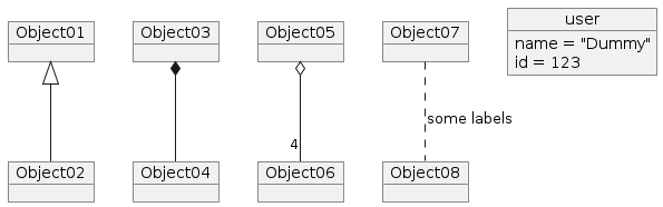
Example 1: Describing elements in an image
CODE:
<annotate src="../../images/annotateSampleObject.png" height="500" alt="Sample Image">
<a-point x="6%" y="50%" content="You can use a triangle and a solid line (not to be confused with an arrow) to indicate class inheritance." label="1" header="Class inheritance" legend="both"/>
<a-point x="25.5%" y="50%" content="UML uses a solid diamond symbol to denote composition." label="2" header="Composition" color="red" legend="both"/>
<a-point x="45%" y="50%" content="UML uses a hollow diamond to indicate an aggregation." label="3" header="Aggregation" color="blue" legend="both"/>
<a-point x="64.5%" y="50%" content="Association labels describe the meaning of the association." label="4" header="Association labels" color="yellow" legend="both"/>
</annotate>
OUTPUT:
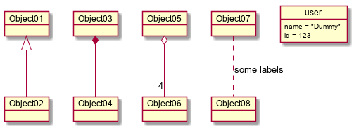
You can use a triangle and a solid line (not to be confused with an arrow) to indicate class inheritance.
UML uses a solid diamond symbol to denote composition.
UML uses a hollow diamond to indicate an aggregation.
Association labels describe the meaning of the association.
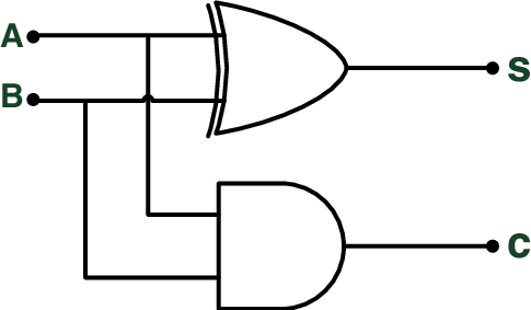
Example 2: Drawing over elements
CODE:
<annotate src="../../images/annotateSampleSequence.png" height="500" alt="Sample Image">
<a-point x="35%" y="18.5%" content="Operation is invoked" header="Operation" opacity="0.2" size="30"/>
<a-point x="65%" y="50%" content="This is the period during which the method is being executed" header="Activation Bar" opacity="0.3" size="50" color="yellow"/>
<a-point x="14%" y="85%" content="Return control and possibly some return value" header="Return Value" opacity="0.2" size="30" color="blue"/>
</annotate>
OUTPUT:
<a-point> Options
| Name | Type | Default | Description |
|---|---|---|---|
| x | String | This must be specified. The x-coordinate of the point. Supports range of values from 0% to 100%. | |
| y | String | This must be specified. The y-coordinate of the point. Supports range of values from 0% to 100%. | |
| content[S] | String | '' | Annotate Point content. The annotation content will be omitted if this is not provided. |
| header[S] | String | '' | Annotate Point header. The header will be omitted if this is not provided. |
| trigger | String | click | Popover trigger type. Supports: click, focus, hover, or any space-separated combination of these. |
| placement | String | top | Position of the Popover. Supports: top, left, right, bottom. |
| label[S] | String | '' | The label shown on the point itself. The label will be omitted if this is not provided. Note that labels should not be too long as they might overflow out of the point. |
| size | String | '40' | The size of the point in pixels. Does not work with customised shapes |
| color | String | 'green' | The color of the point. Supports any color in the CSS color format. E.g. red, #ffffff, rgb(66, 135, 245), etc. Does not work with customised shapes |
| opacity | String | '0.3' | The opacity of the point. Supports range of values from 0 to 1. Does not work with customised shapes |
| fontSize | String | '14' | The font size of the label. Supports any pixel size smaller than size of the point. |
| textColor | String | 'black' | The color of the label. Supports any color in the CSS color format. E.g. red, #ffffff, rgb(66, 135, 245), etc. |
| legend | String | 'popover' | The position of the Annotate Point content and header. The label property must be defined for it to be displayed in the legend.Supports: popover, bottom, both. |
<annotate> Options
This is effectively the same as the options used for the picture component.
| Name | Type | Default | Description |
|---|---|---|---|
| alt | string | This must be specified. The alternative text of the image. | |
| src | string | This must be specified. The URL of the image. The URL can be specified as absolute or relative references. More info in: Intra-Site Links | |
| height | string | '' | The height of the image in pixels. |
| width | string | '' | The width of the image in pixels. If both width and height are specified, width takes priority over height. It is to maintain the image's aspect ratio. |
| lazy | boolean | false | The <annotate> component lazy loads if this attribute is specified.Either the height or width should be specified to avoid layout shifts while lazy loading images. |
<annotate src="../../images/annotateSampleImage.png" width="500" alt="Sample Image">
<a-point x="25%" y="25%" content="Lorem ipsum dolor sit amet" />
<a-point x="50%" y="25%" content="Lorem ipsum dolor sit amet" label="1a"/>
<a-point x="50%" y="25%" content="Lorem ipsum dolor sit amet" label="1b" legend="both"/>
</annotate>
A thumbnail component allows you to insert thumbnails using text, images, or icons.
CODE:
<thumbnail circle src="../../images/deer.jpg" size="100"/>
<thumbnail circle text=":book:" background="#dff5ff" size="100"/>
<thumbnail circle text="___CS___" background="#333" font-color="white" size="100"/>
<thumbnail circle text=":fas-book:" font-color="darkgreen" border="3px solid darkgreen" size="100"/>
<thumbnail src="../../images/deer.jpg" size="100"/>
<thumbnail text=":book:" background="#dff5ff" size="100"/>
<thumbnail text="___CS___" background="#333" font-color="white" size="100"/>
<thumbnail text=":fas-book:" font-color="darkgreen" border="3px solid darkgreen" size="100"/>
OUTPUT:
Options
| Name | Type | Default | Description |
|---|---|---|---|
| alt | string | This must be specified if src is specifiedThe alternative text of the image. | |
| background | string | Specifies the background color. Accepts any valid CSS background property | |
| border | string | Specifies the border thickness, type, and color. Accepts any valid CSS border property | |
| circle | boolean | false | If this option is enabled, the thumbnail will be circle shaped instead of square |
| font-color | string | The color of the text, affects normal text and icons (but not emojis) | |
| font-size | string | Text size, defaults to half of size, affects text, icons and emojis | |
| size | string | 100 | The size of the thumbnail in pixels |
| src | string | The URL of the image. The URL can be specified as absolute or relative references. More info in: Intra-Site Links | |
| text | string | The text to use in the thumbnail, icons, emojis and markdown are supported here |
If both text and src are specified, src will take higher priority.
<thumb circle src="https://markbind.org/images/logo-lightbackground.png" size="100"/>
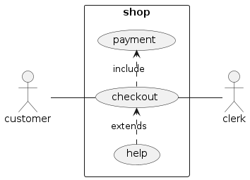
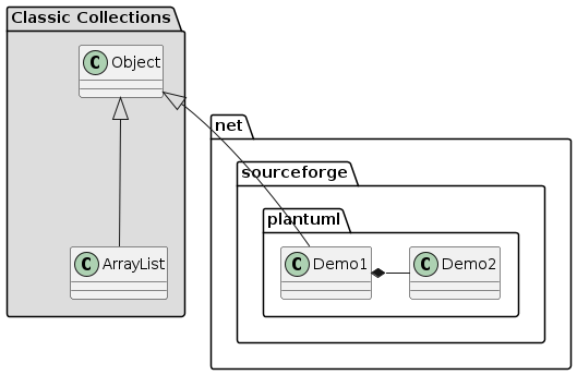
You can use the PlantUML syntax to add diagrams.
The following additional dependencies are involved when using this feature (locally and in your )
site.json like this.CODE:
<puml width="300">
@startuml
alice -> bob ++ : hello
bob -> bob ++ : self call
bob -> bib ++ #005500 : hello
bob -> george ** : create
return done
return rc
bob -> george !! : delete
return success
@enduml
</puml>
OUTPUT:
Alternatively, a PlantUML diagram can be specified in a separate .puml file and inserted into a page using a <puml> tag.
CODE:
diagrams/sequence.puml:
@startuml
alice -> bob ++ : hello
bob -> bob ++ : self call
bob -> bib ++ #005500 : hello
bob -> george ** : create
return done
return rc
bob -> george !! : delete
return success
@enduml
in another file:
<puml src="diagrams/sequence.puml" width=300 />
OUTPUT:

The full PlantUML syntax reference can be found at plantuml.com/guide
Options
| Name | Type | Description |
|---|---|---|
| alt | string | The alternative text of the diagram. |
| height | string | The height of the diagram in pixels. |
| name | string | The name of the output file. Avoid using the same name for different diagrams to prevent overwriting. |
| src | string | The URL of the diagram if your diagram is in another .puml file.The URL can be specified as absolute or relative references. More info in: Intra-Site Links |
| width | string | The width of the diagram in pixels. If both width and height are specified, width takes priority over height. It is to maintain the diagram's aspect ratio. |
<puml width=300>
@startuml
alice -> bob ++ : hello
bob -> bob ++ : self call
@enduml
</puml>
Sequence Diagram:
Use Case Diagram:
Class Diagram:
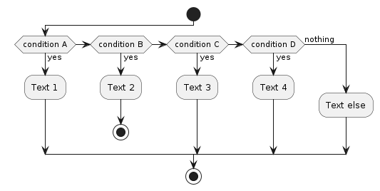
Activity Diagram:
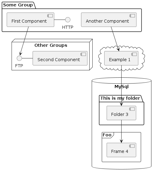
Component Diagram:
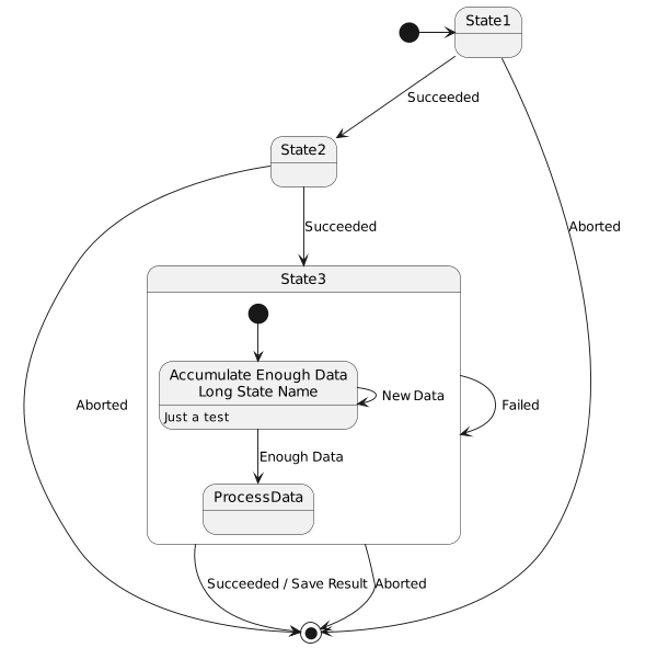
State Diagram:
Object Diagram:

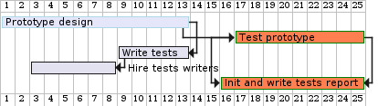
Gantt Diagram:
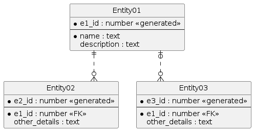
Entity Relation Diagram:
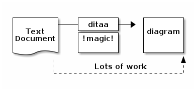
Ditaa Diagram:
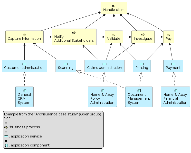
Archimate Diagram:
This plugin allows you to utilize Mermaid by automatically importing the library and initializing the rendering of the diagrams.
Mermaid is a JavaScript based diagramming and charting tool that renders Markdown-inspired text definitions to create and modify diagrams dynamically.
All supported diagrams are available in the Mermaid official documentation. Here are some examples to quickly get started!
To enable this plugin, add mermaid to your site's plugins.
{
...
"plugins": [
"mermaid"
]
}
To create a Mermaid diagram, use the <mermaid> tag and provide the diagram definition within the tag. Usage of standard Mermaid syntax using the <pre class="mermaid"> block directly in Markdown files is also supported for users who prefer to do so.
Example Pie Chart:
CODE:
<mermaid>
pie title Pets adopted by volunteers
    "Dogs" : 386
    "Cats" : 85
    "Rats" : 15
</mermaid>
<pre class="mermaid">
%%{init: {"pie": {"textPosition": 0.5}, "themeVariables": {"pieOuterStrokeWidth": "5px"}, 'theme': 'dark'} }%%
pie showData
    title Key elements in Product X
    "Calcium" : 42.96
    "Potassium" : 50.05
    "Magnesium" : 10.01
    "Iron" :  5
</pre>
OUTPUT:
pie title Pets adopted by volunteers
"Dogs" : 386
"Cats" : 85
"Rats" : 15
%%{init: {"pie": {"textPosition": 0.5}, "themeVariables": {"pieOuterStrokeWidth": "5px"}, 'theme': 'dark'} }%%
pie showData
title Key elements in Product X
"Calcium" : 42.96
"Potassium" : 50.05
"Magnesium" : 10.01
"Iron" : 5
Example Flowchart:
CODE:
<mermaid>
flowchart TD
    A[Start] --> B{Is it?}
    B -->|Yes| C[OK]
    C --> D[Rethink]
    D --> B
    B ---->|No| E[End]
</mermaid>
OUTPUT:
flowchart TD
A[Start] --> B{Is it?}
B -->|Yes| C[OK]
C --> D[Rethink]
D --> B
B ---->|No| E[End]
Example User Journey Diagram:
CODE:
<mermaid>
journey
    title My working day
    section Go to work
      Make tea: 5: Me
      Go upstairs: 3: Me
      Do work: 1: Me, Cat
</mermaid>
OUTPUT:
journey
title My working day
section Go to work
Make tea: 5: Me
Go upstairs: 3: Me
Do work: 1: Me, Cat
Example Gitgraph Diagram:
CODE:
<mermaid>
gitGraph
    commit
    branch develop
    checkout develop
    commit
    checkout main
    merge develop
</mermaid>
OUTPUT:
gitGraph
commit
branch develop
checkout develop
commit
checkout main
merge develop
The plugin automatically converts the <mermaid> tags into appropriate <pre> elements for rendering the diagrams using the Mermaid library.
A tree component allows you to generate tree-like visualisations, suitable for displaying folder structure.
Use indentation (2 spaces) to indicate the level of nesting.
CODE:
<tree>
C:/course/
textbook/
index.md
index.md
reading.md
site.json
</tree>
OUTPUT:
Markdown unordered lists are also supported.
CODE:
<tree>
C:/course/
- textbook/
- index.md
C:/course/
* textbook/
* index.md
C:/course/
+ textbook/
+ index.md
</tree>
OUTPUT:
Besides file system structures, you can use this for any lightweight tree-like structure.
CODE:
<tree>
Enjoy MarkBind?
You may want to:
Like :heart:
Share :speech_balloon:
Contribute :pencil:
</tree>
OUTPUT:
You can use Tree in combination with inline Markdown or inline HTML elements.
CODE:
<tree>
Formatting is supported!
textbook/
`index.md`
**index.md**
~~index.md~~
%%dimmed%%
Super^script^
****Super Bold****
!!Underline!!
!!Underline with {text=danger}!!{.text-danger}
<span class="text-danger">RED</span>
__reading.md__
++site.json++
==hello==
:construction:
:fas-file-code:
:)
</tree>
OUTPUT:
index.md
├── index.md
│ ├── Currently, Pop-Ups(tooltip/trigger) are not supported within a tree component.
You can refer to Formatting Contents to find more information about text styles and other supported inline syntax.
<tree>
C:/course/
textbook/
index.md
index.md
reading.md
site.json
</tree>