Presentational Components
User Guide → Presentational ComponentsPresentation
The components in this page are the core presentational components you may want to use. Panels and tabs can be used to organise content sections, while badges and boxes can highlight small, specific pieces of information.
As presentational components are HTML-based, you need to follow the HTML syntax when using markdown in the content of the components. More specifically, you should use either:
- add a line break with no indentation before the markdown content
- use the
<markdown>(block level elements) or<md>(inline level elements) tags to wrap the markdown content.
For more information, please refer to this section.
Badges
Example:
CODE:
<span class="badge bg-primary">
Some Plain Text
</span>
<span class="badge bg-primary">
<md>_Some Markdown_</md>
</span>
OUTPUT:
You can choose from a variety of colors for your badges. You can also use the rounded-pill class to make the badges pill-shaped.
CODE:
Normal:
<span class="badge bg-primary">Primary</span>
<span class="badge bg-secondary">Secondary</span>
<span class="badge bg-success">Success</span>
<span class="badge bg-danger">Danger</span>
<span class="badge bg-warning text-dark">Warning</span>
<span class="badge bg-info text-dark">Info</span>
<span class="badge bg-light text-dark">Light</span>
<span class="badge bg-dark">Dark</span>
<br>Pills:
<span class="badge rounded-pill bg-primary">Primary</span>
<span class="badge rounded-pill bg-secondary">Secondary</span>
<span class="badge rounded-pill bg-success">Success</span>
<span class="badge rounded-pill bg-danger">Danger</span>
<span class="badge rounded-pill bg-warning text-dark">Warning</span>
<span class="badge rounded-pill bg-info text-dark">Info</span>
<span class="badge rounded-pill bg-light text-dark">Light</span>
<span class="badge rounded-pill bg-dark">Dark</span>
OUTPUT:
Normal:
Primary Secondary Success Danger Warning Info Light Dark
Pills:
Primary Secondary Success Danger Warning Info Light Dark
You can use Badges in combination with headings, buttons, links, etc.
CODE:
Links:
<a href="#" class="badge bg-primary">Primary</a>
<a href="#" class="badge rounded-pill bg-warning text-dark">Warning</a>
Buttons:
<button type="button" class="btn btn-primary">
Difficulty Level <span class="badge bg-light text-dark">4</span>
</button>
Headings:
### Feature X <span class="badge bg-danger">beta</span> {.no-index}
##### Feature Y <span class="badge rounded-pill bg-success">stable</span> {.no-index}
OUTPUT:
You can refer to Bootstrap documentation to find more information about Badges.
<span class="badge bg-primary">Primary</span>
<span class="badge rounded-pill bg-success">Success</span>
<button type="button" class="btn btn-primary">
Difficulty Level <span class="badge bg-light text-dark">4</span>
</button>
Boxes
Simple Example
CODE:
<box>
plain text
</box>
<box>
<md>_markdown_</md>
</box>
OUTPUT:
Boxes come with different built-in types.
CODE:
<box type="info">
info
</box>
<box type="warning">
warning
</box>
<box type="success">
success
</box>
<box type="important">
important
</box>
<box type="wrong">
wrong
</box>
<box type="tip">
tip
</box>
<box type="definition">
definition
</box>
<box type="info" dismissible>
dismissible info
</box>
<box type="success" header="#### Header :rocket:" icon-size="2x">
Lorem ipsum dolor sit amet, consectetur adipiscing elit, sed do eiusmod tempor incididunt ut labore et dolore magna aliqua. Ut enim ad minim veniam, quis nostrud exercitation ullamco laboris nisi ut aliquip ex ea commodo consequat.
<box type="warning" header="You can use **markdown** here! :pizza:" dismissible>
Lorem ipsum dolor sit amet, consectetur adipiscing elit, sed do eiusmod tempor incididunt ut labore et dolore magna aliqua.
</box>
</box>
OUTPUT:
Lorem ipsum dolor sit amet, consectetur adipiscing elit, sed do eiusmod tempor incididunt ut labore et dolore magna aliqua. Ut enim ad minim veniam, quis nostrud exercitation ullamco laboris nisi ut aliquip ex ea commodo consequat.
You can use markdown here! 🍕
The built in types can be colored.
CODE:
<box type="info" theme="primary">
primary
</box>
<box type="info" theme="secondary">
secondary
</box>
<box type="info" theme="success">
success
</box>
<box type="info" theme="danger">
danger
</box>
<box type="info" theme="warning">
warning
</box>
<box type="info" theme="info">
info
</box>
<box type="info" theme="light">
light
</box>
<box type="info" theme="dark">
dark
</box>
OUTPUT:
MarkBind also supports a light color scheme for boxes
CODE:
<box light>
default light
</box>
<box type="info" light>
info light
</box>
<box type="warning" light>
warning light
</box>
<box type="success" light>
success light
</box>
<box type="important" light>
important light
</box>
<box type="wrong" light>
wrong light
</box>
<box type="tip" light>
tip light
</box>
<box type="definition" light>
definition light
</box>
<box type="definition" header="##### Header markdown :rocket:" light>
definition light with header markdown
</box>
OUTPUT:
MarkBind also supports a seamless style of boxes
As light and seamless are mutually exclusive styles, light takes priority over seamless.
CODE:
<box seamless>
default seamless
</box>
<box type="info" seamless>
info seamless
</box>
<box type="warning" seamless>
warning seamless
</box>
<box type="success" seamless>
success seamless
</box>
<box type="important" seamless>
important seamless
</box>
<box type="wrong" seamless>
wrong seamless
</box>
<box type="tip" seamless>
tip seamless
</box>
<box type="definition" seamless dismissible>
dismissible definition seamless
</box>
<box type="definition" header="##### Header markdown :rocket:" seamless>
success seamless with header markdown
</box>
OUTPUT:
You can further customize the Box's appearance.
CODE:
<box background-color="#ffca6a" border-color="grey" border-left-color="#8b5a01">
default type, styled as an orange box with a brown left border
</box>
<box type="info" color="red" icon=":rocket:">
info, with a custom markdown rocket icon and `red` colored text.
You can use any inline markdown in the `icon` property.
</box>
OUTPUT:
info, with a custom markdown rocket icon and red colored text.
You can use any inline markdown in the icon property.
You can remove the background, icon and borders of preset styles.
CODE:
<box no-icon no-background type="success">
success box without a tick icon and backgound
</box>
<box no-border type="definition" light>
definition type box, light style without border
</box>
OUTPUT:
Note
Custom styles ( background-color, border-color, border-left-color, icon ) as introduced in the previous section, takes precedence over the no-background, no-border, no-icon attributes.
You can also use icons, resize them and change their color accordingly.
CODE:
<box type="success" icon=":fas-camera:">
Lorem ipsum dolor sit amet, consectetur adipiscing elit
</box>
<box type="warning" icon=":fas-camera:" icon-size="2x">
Lorem ipsum dolor sit amet, consectetur adipiscing elit, sed do eiusmod tempor incididunt ut labore et dolore magna aliqua.
</box>
<box type="definition" icon=":fas-camera:" icon-size="3x">
Lorem ipsum dolor sit amet, consectetur adipiscing elit, sed do eiusmod tempor incididunt ut labore et dolore magna aliqua. Ut enim ad minim veniam, quis nostrud exercitation ullamco laboris nisi ut aliquip ex ea commodo consequat.
</box>
<box type="info" icon=":fas-camera:" icon-color="red" icon-size="3x">
Lorem ipsum dolor sit amet, consectetur adipiscing elit, sed do eiusmod tempor incididunt ut labore et dolore magna aliqua. Ut enim ad minim veniam, quis nostrud exercitation ullamco laboris nisi ut aliquip ex ea commodo consequat.
</box>
OUTPUT:
Options
| Name | Type | Default | Description |
|---|---|---|---|
| background-color | String | null | |
| border-color | String | null | |
| border-left-color | String | null | Overrides border-color for the left border. |
| color | String | null | Color of the text. |
| dismissible | Boolean | false | Adds a button to close the box to the top right corner. |
| icon[S] | String | null | Inline MarkDown text of the icon displayed on the left. |
| icon-size | String | null | Resizes the icon. Supports integer-scaling of the icon dimensions e.g. 2x, 3x, 4x, etc. |
| icon-color | String | null | Color of the icon. |
| header[S] | String | null | Markdown text of the box header. |
| type | String | '' | Supports: info, warning, success, important, wrong, tip, definition, or empty for default. |
| theme | String | '' | Supports: primary, secondary, success, danger, warning, tip, light, dark or empty for default. |
| light | Boolean | false | Uses a light color scheme for the box. |
| seamless | Boolean | false | Uses a seamless style for the box. If light is specified, this style will not be activated. |
| no-border | Boolean | false | Removes border, except if styled by border-color or border-left-color. |
| no-background | Boolean | false | Removes background, except if styled by background-color option. |
| no-icon | Boolean | false | Removes icon, except if icon is displayed via icon option. |
| no-page-break | Boolean | false | Prints the box fully on a single page by moving it to a new page if needed. |
<box type="warning">
warning
</box>
Panels
Panel is a flexible container that supports collapsing and expanding its content. It is expandable by default.
CODE:
<panel header="This is your header for a Panel, click me to expand!">
<markdown>_markdown_</markdown>
<p>plain text ...</p>
</panel>
OUTPUT:
With minimized attribute, panel is minimized into an inline block element. The alt attribute is for you to specify the minimized block header.
CODE:
<panel header="How to cultivate a tomato plant at home" alt="Tomatoes" minimized>
Lorem ipsum ...
</panel>
OUTPUT:
With expanded attribute, you can set the panels to be expanded when loaded in.
CODE:
<panel header="Have your readers click less to see the Panel's contents" expanded>
Lorem ipsum ...
</panel>
OUTPUT:
With the expand-headerless attribute, you can hide the panel header when it is expanded.
CODE:
<panel header="This header will only show when the Panel is collapsed" expand-headerless>
Lorem ipsum ...
</panel>
OUTPUT:
With the peek attribute, you may showcase part of your content without expanding the panel.
CODE:
<panel header="Give your readers a peek of the content without expanding Panel" peek>
Lorem ipsum dolor sit amet, consectetur adipisicing elit, sed do eiusmod tempor incididunt ut labore et dolore
magna aliqua. Ut enim ad minim veniam, quis nostrud exercitation ullamco laboris nisi ut aliquip ex ea commodo
consequat. Duis aute irure dolor in reprehenderit in voluptate velit esse cillum dolore eu fugiat nulla pariatur.
Excepteur sint occaecat cupidatat non proident, sunt in culpa qui officia deserunt mollit anim id est laborum.
Curabitur ornare ipsum eu ex congue egestas. Maecenas pretium nibh sed enim ornare finibus. Mauris quis metus
facilisis, mattis tellus nec, pulvinar mi. Quisque at vehicula lectus. Ut ac lacus mi. Donec mattis nec velit
eget tincidunt. Maecenas vel mauris mattis nisl tempor sollicitudin. Orci varius natoque penatibus et magnis
dis parturient montes, nascetur ridiculus mus. Duis tincidunt diam eu dolor pellentesque, eget dignissim tortor
pellentesque.
</panel>
OUTPUT:
Panel provides many types that change its appearance.
CODE:
<panel header="**light type panel (DEFAULT)**" type="light" minimized>
...
</panel>
<panel header="**dark type panel**" type="dark" minimized>
...
</panel>
<panel header="**primary type panel**" type="primary" minimized>
...
</panel>
<panel header="**secondary type panel**" type="secondary" minimized>
...
</panel>
<panel header="**info type panel**" type="info" minimized>
...
</panel>
<panel header="**danger type panel**" type="danger" minimized>
...
</panel>
<panel header="**warning type panel**" type="warning" minimized>
...
</panel>
<panel header="**success type panel**" type="success" minimized>
...
</panel>
<panel header="**seamless type panel**" type="seamless" minimized>
...
</panel>
<panel header="**minimal type panel**" type="minimal" minimized>
...
</panel>
OUTPUT:
💡 Seamless panels inherit the background colour and text colour of any parents!
Show/Hide buttons using no-switch, no-close, or no-minimized-switch.
CODE:
<panel header="**This minimized panel does not have a switch button**" minimized no-minimized-switch>
...
</panel>
<panel header="This panel does not have a switch button" no-switch>
...
</panel>
<panel header="This panel does not have a close button" no-close>
...
</panel>
<panel header="This panel does not have either buttons" no-close no-switch>
...
</panel>
OUTPUT:
Use markdown in the header (only inline level markdown are supported).
CODE:
<panel header="**Bold text** :rocket: " type="seamless">
...
</panel>
OUTPUT:
Bold text 🚀 
If src attribute is provided, the panel will take content from the src specified and add it to the Panel body.
CODE:
<panel header="Content loaded in from 'src'" src="extra/loadContent.html#fragment" minimized></panel>
OUTPUT:
Importing external resources that contains script or styles can inadvertently take global effects on your MarkBind website. Due to hoisting during processing, imported scripts and stylesheets affect the entire page. This could potentially alter its appearance and behavior beyond the intended scope.
For example, if a CSS file imported via such means styles headings to be red, this change will be reflected page-wide.
To safeguard against unintended consequences, consider directly incorporating the code or customizing styles to target specific elements or classes not used universally. This approach grants more precise control over your website's presentation and reduces the risk of unexpected changes.
If popup-url attribute is provided, a popup button will be shown. If clicked, it opens the specified url in a new window.
CODE:
<panel header="Try clicking on my pop-up button" popup-url="/userGuide/syntax/extra/loadContent.html">
This panel has a popup.
</panel>
OUTPUT:
Add {{ baseUrl }} to make your URLs absolute links if they may be reused in different contexts
Make an internal relative link an absolute link by adding {{ baseUrl }} in front of the path. This allows the link to always point to the same target. Keep this in mind when putting content with links that is reused (eg: via <include>). This is because when your content is re-used, a relative link may no longer point to where you want it to.
If preload attribute is provided, the panel body will load the HTML when the page renders instead of after being expanded.
CODE:
<panel header="Right click and inspect my HTML before expanding me!" src="extra/loadContent.html#fragment" preload>
<p>You should be able to find this text before expanding the Panel.</p>
</panel>
OUTPUT:
You can nest Panels or other components within a Panel.
CODE:
<panel header="Parent Panel">
<panel header="Level 1 Nested Panel">
<panel header="Level 2 Nested Panel">
<box type="success">
I'm a nested box
</box>
<panel header="Level 3 Nested Panel" type="minimal">
minimal-type panel
</panel>
</panel>
</panel>
<panel header="Level 1 Nested Panel" type="info">
Some Text
</panel>
</panel>
OUTPUT:
Options
| Name | Type | Default | Description |
|---|---|---|---|
| header[S] | String | '' | The clickable text on the Panel's header. Supports MarkDown text. |
| alt[S] | String | Panel header | The clickable text on the minimised Panel. Supports MarkDown text. When using slots, the slot name is _alt. |
| expandable | Boolean | true | Whether Panel is expandable. |
| expanded | Boolean | false | Whether Panel is expanded or collapsed when loaded in. |
| minimized | Boolean | false | Whether Panel is minimized. |
| expand-headerless | Boolean | false | Whether to hide the header text when the Panel is expanded. |
| peek | Boolean | false | Whether to show part of the content when the Panel is collapsed. |
| no-close | Boolean | false | Whether to show the close button. |
| no-switch | Boolean | false | Whether to show the expand switch. |
| no-page-break | Boolean | false | Prints the panel fully on a single page by moving it to a new page if needed. |
| bottom-switch | Boolean | true | Whether to show an expand switch at the bottom of the panel. Independent of no-switch. |
| popup-url | String | The URL that the popup window will navigate to. The URL can be absolute or relative. | |
| preload | Boolean | false | Whether the content is loaded immediately from src. |
| src | String | The path to another local markdown .md or HTML .html file whose content will be loaded into the Panel body. Supports file fragments by specifying #fragment-id at the end of the src attribute, provided the fragment is wrapped in a <div>/<span> tag with the matching id. | |
| type | String | light | The type or color scheme of the panel (single). Supports: light, dark, primary, secondary, info, success, warning, danger, seamless, minimal. |
<panel header="primary type panel" type="primary" >
...
</panel>
minimal type panel
Tabs
CODE:
<tabs>
<tab header="First tab">
Text in the first tab
<markdown>_some markdown_</markdown>
</tab>
<tab header="Disabled second tab :x:" disabled>
</tab>
<tab header="Tab not printed" class="d-print-none">
This tab will not be printed.
</tab>
<tab-group header="Third tab group :milky_way:">
<tab header="Stars :star:">
Some stuff about stars ...
</tab>
<tab header="Disabled Moon :new_moon:" disabled>
</tab>
</tab-group>
<tab-group header="Disabled fourth tab group" disabled>
<tab header="Hidden tab">
Lorem ipsum dolor sit amet, consectetur adipiscing elit. Nulla ullamcorper ultrices lobortis.
</tab>
</tab-group>
</tabs>
OUTPUT:
some markdown
Options
tabs:
| Name | Type | Default | Description |
|---|---|---|---|
| active | Number | 0 | Active Tab index (0-based) |
tab:
| Name | Type | Default | Description |
|---|---|---|---|
| header[S] | String | null | Tab title. |
| disabled | Boolean | false | Whether Tab is clickable and can be activated. |
tab-group:
| Name | Type | Default | Description |
|---|---|---|---|
| header[S] | String | null | Tab Group title. |
| disabled | Boolean | false | Whether Tab Group is clickable and can be activated. |
Tabs, tab group and individual tab can be omitted during printing by adding Bootstrap's display property class="d-print-none" to the respective components.
<tabs>
<tab header="First tab">
Content of the first tab
</tab>
<tab header="Second tab">
Contents of the second tab
</tab>
<tab-group header="Third tab group :tv:">
<tab header="Stars :star:">
Some stuff about stars ...
</tab>
<tab header="Moon">
Some stuff about the moon ...
</tab>
</tab-group>
</tabs>
Card Stack
The Card Stack component allows you to display a collection of information in the form of a cards layout. The cardstack component acts as the container for card components each containing the content you want to show.
A cardstack component is used in conjunction with one or more card components.
cardstack: Wrapper used to hold cards and their content.card: Card contains the information to display.
Each card contains tag and keyword field:
Keywords: Adds to the search space but does not allow users to filter them manually. Add keywords when the content have different known aliases.Tags: Adds to the search space and also provides readers a way to filter the cards according to the selected tags. Add tags to categorise the content.
The search feature searches the card components of cardstack by header, tags and keywords specified within each card component.
Specifying them can help improve searchability of the cardstack component!
For example, if a card is about "Machine Learning," you might tag it as AI and Data Science and add keywords like ML and Artificial Intelligence to improve searchability.
CODE:
<cardstack searchable>
<card header="**Winston Churchill**" tag="Success, Perseverance">
Success is not final, failure is not fatal: it is the courage to continue that counts
</card>
<card header="**Albert Einstein**" tag="Success, Perseverance">
In the middle of every difficulty lies opportunity
</card>
<card header="**Theodore Roosevelt**" tag="Motivation, Hard Work">
Do what you can, with what you have, where you are
</card>
<card header="**Steve Jobs**" tag="Happiness, Mindset">
Your time is limited, so don’t waste it living someone else’s life
</card>
</cardstack>
OUTPUT:
As shown in the above example,
- a
cardcan be given aheaderattribute (optional). - tags can be added to cards using the
tagattribute, which can then be used to filter cards. - the
searchableattribute can be used to make the Card Stack searchable based on tags and headers.
In the example given below, a Card Stack is used to show a list of questions and answers, by including question components inside card components.
CODE:
<cardstack searchable blocks="1">
<card header="**Multiple Response Question**" tag="MRQ" keywords="Mutliple Response Question, Math, Algebra">
<question type="checkbox" header="Which of the following is correct?" hint="Think out of the box! :fas-box:">
<!-- Details of questions omitted. -->
</question>
</card>
<card header="**Multiple Choice Question**" tag="MCQ" keywords="Mutliple Choice Question, Test cases, testing">
<question type="mcq" header="Which of these **contradicts** the heuristics recommended when creating test cases with multiple inputs?">
<!-- Details of questions omitted. -->
</question>
</card>
</cardstack>
OUTPUT:
The example above also illustrates how to use the keywords attribute to specify additional search terms for a card.
Custom Tag Order and Colors
You can customize the order and colors of tags by using a <tags> element inside the cardstack:
CODE:
<cardstack searchable>
<tags>
<tag name="Success" color="#28a745" />
<tag name="Perseverance" color="#17a2b8" />
<tag name="Motivation" color="#ffc107" />
<tag name="Hard Work" color="#dc3545" />
<tag name="Happiness" color="#6f42c1" />
<tag name="Mindset" color="#fd7e14" />
</tags>
<card header="**Winston Churchill**" tag="Success, Perseverance">
Success is not final, failure is not fatal: it is the courage to continue that counts
</card>
<card header="**Albert Einstein**" tag="Success, Perseverance">
In the middle of every difficulty lies opportunity
</card>
<card header="**Theodore Roosevelt**" tag="Motivation, Hard Work">
Do what you can, with what you have, where you are
</card>
<card header="**Steve Jobs**" tag="Happiness, Mindset">
Your time is limited, so don't waste it living someone else's life
</card>
</cardstack>
OUTPUT:
You can also use Bootstrap color names instead of hex colors:
CODE:
<cardstack searchable>
<tags>
<tag name="Success" color="success" />
<tag name="Perseverance" color="info" />
<tag name="Motivation" color="warning" />
<tag name="Hard Work" color="danger" />
</tags>
<card header="**Winston Churchill**" tag="Success, Perseverance">
Success is not final, failure is not fatal: it is the courage to continue that counts
</card>
<card header="**Albert Einstein**" tag="Success, Perseverance">
In the middle of every difficulty lies opportunity
</card>
<card header="**Theodore Roosevelt**" tag="Motivation, Hard Work">
Do what you can, with what you have, where you are
</card>
</cardstack>
OUTPUT:
The <tags> element allows you to:
- Specify the order in which tags appear in the filter badges
- Assign custom colors to each tag using either:
- Hex format (e.g.,
#28a745) - Bootstrap color names (e.g.,
success,danger,primary,warning,info,secondary,light,dark)
- Hex format (e.g.,
- Any tags used in cards but not defined in
<tags>will appear after the defined tags with default colors
Disabling Tag Counts
By default, tag badges display a count showing how many cards have that tag. You can disable this count display using the disable-tag-count attribute:
CODE:
<cardstack searchable disable-tag-count>
<card header="**Winston Churchill**" tag="Success, Perseverance">
Success is not final, failure is not fatal: it is the courage to continue that counts
</card>
<card header="**Albert Einstein**" tag="Success, Perseverance">
In the middle of every difficulty lies opportunity
</card>
<card header="**Theodore Roosevelt**" tag="Motivation, Hard Work">
Do what you can, with what you have, where you are
</card>
<card header="**Steve Jobs**" tag="Happiness, Mindset">
Your time is limited, so don't waste it living someone else's life
</card>
</cardstack>
OUTPUT:
With disable-tag-count enabled, tag badges will only show the tag name and selection indicator, without the numerical count.
Options
cardstack:
| Name | Type | Default | Description |
|---|---|---|---|
| blocks | String | 2 | Number of card columns per row.Supports: 1, 2, 3, 4, 6 |
| searchable | Boolean | false | Whether the card stack is searchable. |
| show-select-all | Boolean | true | Whether the select all tag button appears. (false by default if total tags ≤ 3) |
| disable-tag-count | Boolean | false | Whether to hide the tag count badges. By default, counts are shown. |
tags (optional):
A container element inside cardstack to define tag ordering and colors.
tag (inside tags element):
| Name | Type | Default | Description |
|---|---|---|---|
| name | String | (required) | The name of the tag (must match tags used in cards). |
| color | String | (auto) | Custom color for the tag. Supports hex format (e.g., #28a745) or Bootstrap color names (e.g., success, danger, primary).If not specified, uses default Bootstrap color scheme. |
card:
| Name | Type | Default | Description |
|---|---|---|---|
| tag | String | null | Tags of each card component. Each unique tag should be separated by a ,.Tags are added to the search field. |
| header | String | null | Header of each card component. Supports the use of inline markdown elements. |
| keywords | String | null | Keywords of each card component. Each unique keyword should be separated by a ,.Keywords are added to the search field. |
| disabled | Boolean | false | Disable card. This removes visibility of the card and makes it unsearchable. |
<cardstack searchable blocks="2">
<card header="**Basic Card** :rocket:" tag="Basic Card" keywords="Basic">
This is a basic card.<br>
Click on this <trigger for="modal:triggerBait" trigger="click">trigger!</trigger>.
<modal header="**You clicked on a Trigger!** :rocket:" id="modal:triggerBait">
<md>You have just triggered a modal controlled by a trigger called trigger! :rofl:</md>
</modal>
</card>
<card header="A *markdown* header" tag="Markdown, header, Cool" keywords="">
You can apply markdown to headers and body elements!
<box type="warning">
<md>>**Like** *this* [cool](#cardstacks) `text` :cool:</md>
</box>
</card>
<card header="Card with Image" keywords="Super duper cool" tag="Image, Cool">
<annotate src="../../images/annotateSampleImage.png" height="500" alt="Sample Image">
<a-point x="2%" y="13%" content="I am annotated" header="Annotated point" opacity="0.2" size="20"/>
</annotate>
</card>
<card header="Disabled card" tag="Disabled" keywords="Disabled" disabled>
This card is disabled and will not show
</card>
<card header="An **interesting** question" tag="Question, Markdown" keywords="">
<question type="checkbox" header="Which of the following is correct?" hint="Think out of the box! :fas-box:">
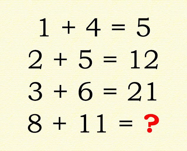
<pic src="/images/math-question.jpg" alt="math question image" height="200" class="d-block mx-auto">
<small><md>Adapted from [Daily Mail](https://www.dailymail.co.uk/femail/article-4702868/Can-pass-intelligence-test.html)</md>
</small>
</pic>
<q-option correct reason="Multiply the numbers on the left together and add the leftmost number!">
96
</q-option>
<q-option reason="Under normal circumstances, this would be correct.">
19
</q-option>
<q-option correct reason="Simply add the running sum of the results as well!">
40
</q-option>
<q-option>
811
</q-option>
</question>
</card>
</cardstack>